Stata visualization
Visualization in Stata can be quite counterintuitive. I have put together two help sheets that can serve as a starting point if you want to make a plot but don’t know how. The first sheet gives an overview of most of the available plot types in Stata, sorted by the type of variables you can plot with them. The frame indicates whether they are part of the twoway syntax, the graph syntax, or are user-written. If you decide to use the graph syntax, the second sheet helps with that. Again, the margin tells you what kind of variables you can plot with what kind of syntax.
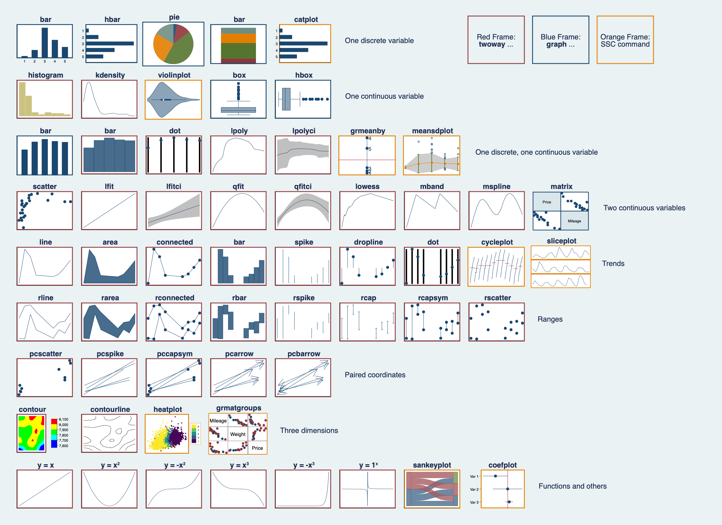
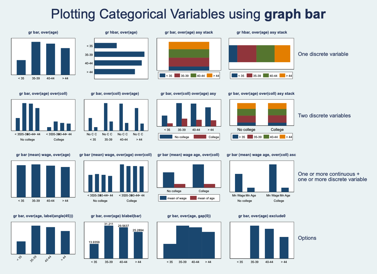
An example: you have a dataset of countries, and you want to plot the mean number of years since independence by continent. The number of years since independence is a continuous variable, and the continent is a categorical one. The first sheet tells which commands you could use in the third row. You decide on graph bar (twoway bar would also be possible but necessitates a transformation of your variable). From the second sheet (again, third row), you can extract the baseline syntax for your plot:
gr bar (mean) wage, over(age)
Wage is the continuos variable, in your example the number of years since independence, age is the categorical variable, so you have to replace it with the continent.
PhD advice
Here are some resources that I found (more or less) helpful in applying for or doing a PhD:
- Arthur Spirling, “On Being a (Successful) Graduate Student”
- Lane Kenworthy, “Advice to First-year PhD students”
- Gary King, “Dissertation Advice”
- Philippe C. Schmitter, “The ‘ideal’ research proposal”
- University of Oxford, “How to write a research proposal”
- Sönke Ahrens: “How to take smart notes” (Book)
- Macartan Humphreys, “Applying for A PhD”